How Smart Inks are Changing the Digital Print Industry Introduction The digital printing industry is constantly evolving, and one of the most exciting innovations is the development of smart inks. These advanced inks offer unique functionalities such as color-changing properties, enhanced durability, and interactive features that transform the way prints are created and used. Smart …
More-
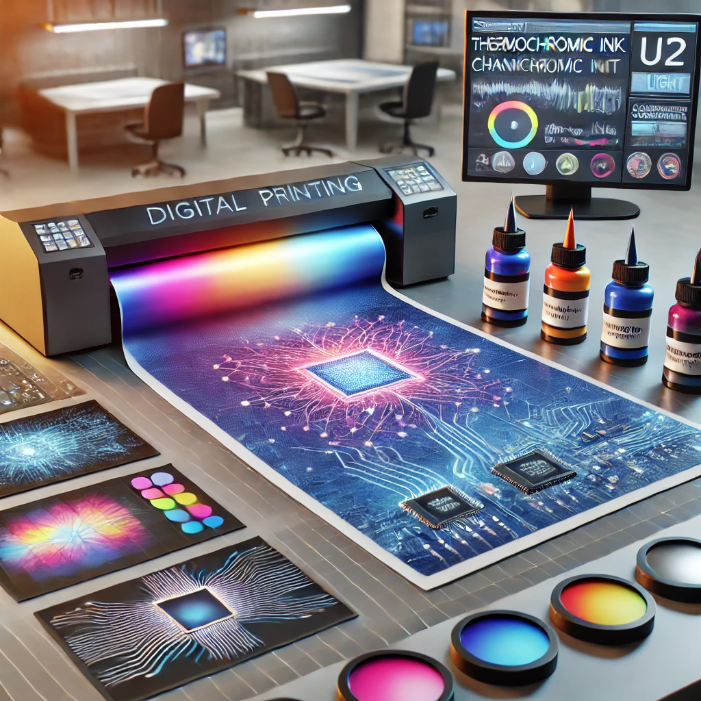
Smart Inks
-

The Role of Augmented Reality in Digital Print Media
Introduction The digital print industry is evolving rapidly, and one of the most groundbreaking innovations is the integration of Augmented Reality (AR). AR enhances print media by overlaying digital content onto physical prints, creating immersive and interactive experiences. From marketing campaigns to educational materials, AR is revolutionizing how audiences engage with print media. This blog …
More -
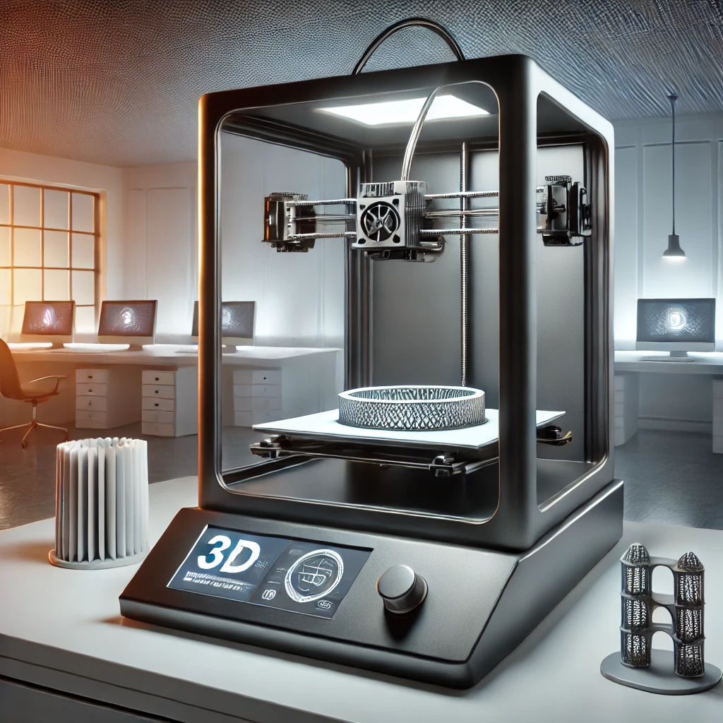
Exploring 3D Printing in the Digital Print Industry
Introduction In recent years, 3D printing has emerged as a transformative force in the digital print industry. This technology has revolutionized traditional printing methods by enabling the creation of three-dimensional objects from digital designs. As businesses explore innovative printing solutions, understanding the impact, benefits, and best practices of 3D printing becomes essential. This blog delves …
More -

How to Achieve Metallic and Foil Effects in Digital Printing
Introduction Metallic and foil effects add a luxurious and eye-catching touch to printed materials, making them ideal for high-end branding, invitations, business cards, and packaging. With advancements in digital printing, achieving these effects has become more accessible, eliminating the need for traditional hot stamping methods. In this guide, we’ll explore the techniques, benefits, and best …
More